You make it great. We make it found.
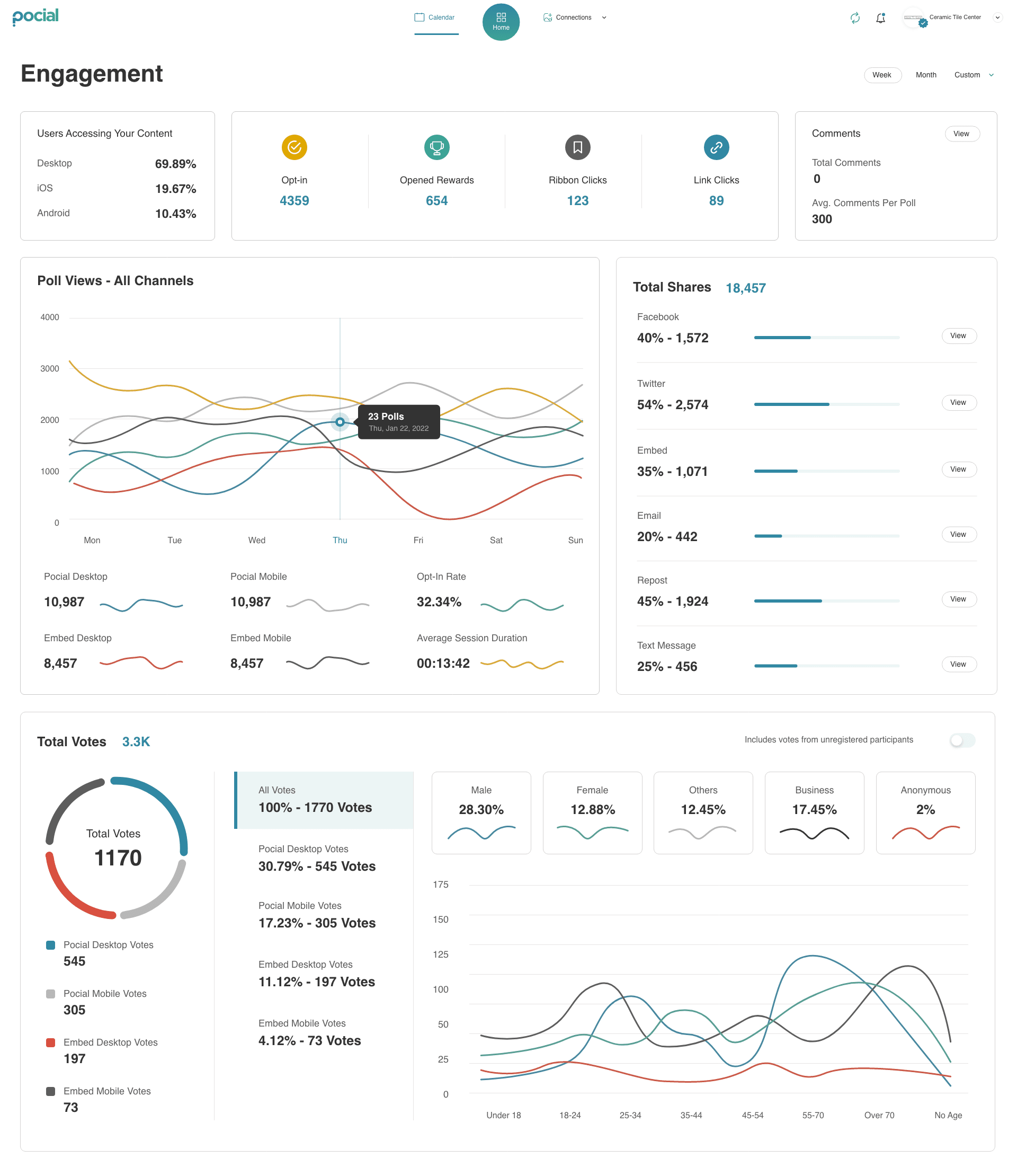
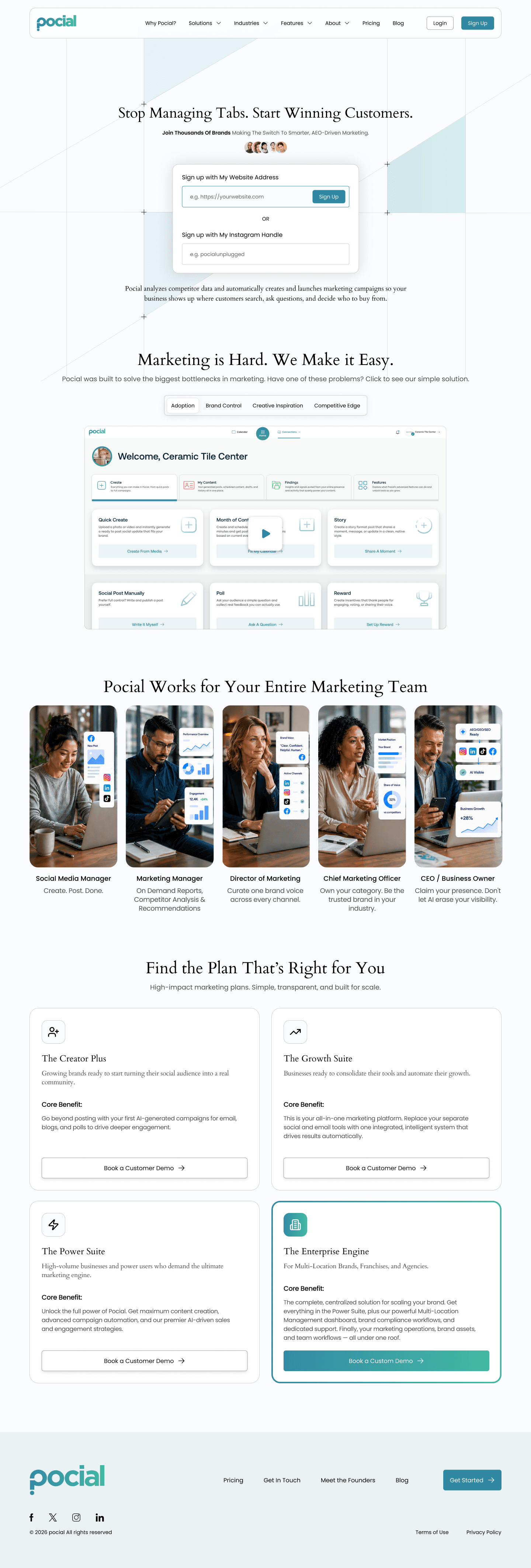
Pocial is an AI marketing-automation platform that helps businesses show up where customers search. I designed the whole experience — a public marketing site that routes two very different audiences, and a 20+ tool dashboard organized into four color-coded hubs.
— Role
Principal UX Designer
— Team
Solo · design end-to-end
— Scope
Marketing site + platform
— Shipped
25 screens, one system
Marketing is hard. The design job was to make it feel effortless.
Pocial exists to solve a deeply human problem: marketing consumes people's lives. The owner is trapped between running their company and feeding the content machine; the agency is stretched thin across a dozen brands. The product promised to automate that grind — but a promise that big invites skepticism.
So the design challenge wasn't visual polish. It was trust. Every screen had to make a tired, doubtful visitor feel the product was built for them — and that it would actually work.
Two audiences, twenty tools, one skeptical category.
One. Two audiences, one product. Enterprises and agencies need scale, multi-location control, and brand compliance. Small businesses and creators need speed and simplicity. The same homepage had to win both without watering down either.
Two. Twenty-plus tools in one platform. Pile them into a sidebar and the product feels like work. The dashboard needed an organizing principle that stayed learnable as it grew.
Three. A category trained to distrust. “AI marketing automation” sets off alarm bells. The interface had to earn belief at every step, not demand it.
Before designing, I mapped who we were really designing for.
The brief named “two audiences,” but two audiences don't make decisions — people do. So I turned the abstract brief into proto-personas: two people at opposite ends of the product, each with their own goals and the specific frustrations Pocial had to dissolve.
A note on rigor: these are proto-personas — synthesized from the brand's established audience and the MarTech landscape rather than a formal interview study, then validated against the five roles the product serves. They gave every later decision a person to answer to.
Maya R.
Social Media Manager
28 · agency-side · runs 6 client accounts
Goals
- Stay consistent across every client
- Hit the monthly quota without burning out
- Show account leads it's working
Pain Points
- A content calendar that never ends
- Six logins, ten disconnected tools
- Creative burnout, no time to think
“By Friday I've made eighty posts and I couldn't tell you what any of them said.”
Clifton D. Cooper
Co-founder & CEO
44 · 3-location café group · no marketing team
Goals
- Stay visible online without hiring
- Turn happy customers into content
- Run the business, not the feed
Pain Points
- Marketing eats nights and weekends
- No idea what's actually working
- “AI marketing” sounds risky and complex
“I didn't open a café to become a content creator.”
Two extremes, one product.
Led to → the dual-path architecture, so each person only sees language written for them.
The enemy is time & clutter.
Led to → a deliberately flat platform with color-coded hubs instead of a tool maze.
Skepticism is the real barrier.
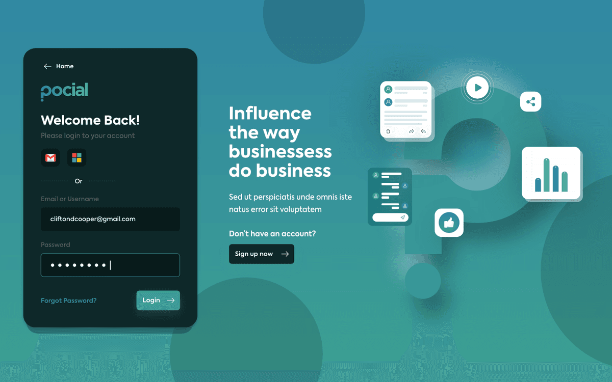
Led to → trust earned at every step — right down to the login screen.
Two audiences and twenty tools collapsed into one question.
This product wouldn't win or lose on features — it would win or lose on routing and trust. Every visitor had to feel the product was built for them, the moment they landed.
Route, don't crowd.
Every entry point commits to one audience. No visitor sees a feature meant for the other.
Name the fear, then answer it.
Lead with the user's real anxiety, and resolve it in the same breath.
One system, every surface.
A single visual and interaction language from marketing site to deep platform tool.
One process, repeated for every screen.
Immerse
Brand philosophy, business goals, and the competitive SaaS landscape.
Define
Five roles, two audience tracks, and the jobs each one needs done.
Architect
IA for a guided public site and a deliberately flat platform.
Flows
Onboarding, dual-path routing, and the Snap2Share loop.
System
Color-coded wayfinding, one card pattern, fail-safe inputs.
Ship
Homepage through every page, plus 25 platform screens.
One platform, two paths to success.
Rather than one-size-fits-all messaging, the whole site splits cleanly at the first decision point. Every nav branch reinforces one of two journeys — so visitors only ever see the product made for them.
Path 01 — Enterprise & Agencies
Scale your agency, not your headcount.
For teams managing many brands and locations, where compliance and capacity matter most.
Path 02 — Small Business & Creators
An effortless way to grow your business.
For owners and creators who need consistent presence without a marketing team.
It works for the entire marketing team.
The homepage speaks to five roles in their own language — so everyone from the person posting daily to the executive protecting the brand sees themselves in the product.
01
Social Media Manager
“Create. Post. Done.”
02
Marketing Manager
“One calendar, every channel.”
03
Director of Marketing
“Proof it's working.”
04
Chief Marketing Officer
“Brand control at scale.”
05
CEO / Owner
“Claim your presence.”
Two maps: a guided site, a flat platform.
The marketing site is structured to route — every dropdown nudges a visitor toward their path. The platform is structured to stay out of the way — no sidebar, no deep nesting, every tool one or two taps from a single dashboard.
- Philosophy
- Three pillars
- FAQ
- Overview
- Enterprise & Agencies
- Small Business
- Real Estate
- Restaurants
- Fitness & Wellness
- Retail Franchises
- Overview
- Multi-Location
- Snap2Share
- Month of Content
- Story
- Our Mission
- Careers
- Contact
Public website — five nav pillars, each routing to an audience or industry story.
- Quick Create
- Month of Content
- Story & Post
- Poll / Reward
- Gallery
- Campaigns
- Social queue
- Emails
- Data Vault
- Competitors
- Social Stats
- Lead Funnel
- Snap2Share
- Scan & Go
- Event Suite
- Email Suite
- Calendar
- Connections
- Public profile
- Wallet
Internal platform — one dashboard, four hubs, global tools always in reach.
Every headline names a fear, then answers it.
One recurring decision did a lot of heavy lifting: a two-part headline where the contrast phrase is always the reassurance. A skimming reader's eye lands straight on the accent word — the promise.
20+ tools, organized by color.
The dashboard has no sidebar. Every tool lives under one of four color-coded hubs — so wayfinding is instant and the interface stays learnable even as it scales. Color does the navigating.
Create
Composer, templates, and the AI campaign builder.
Schedule
Calendar, queues, and automated posting.
Engage
UGC vault, inbox, and community tools.
Analyze
Performance, segments, and reporting.
One QR code. Eight automated steps.
The product's most powerful idea, designed as a story rather than a feature list: a single printed QR code kicks off a chain that captures content, rewards the customer, and feeds the calendar — with no manual work.
01
Print the QR
A business prints a Snap2Share code for its location or event.
02
Customer scans
A guest scans it in the moment, on their own phone.
03
Uploads content
They submit a photo or video through the branded portal.
04
Gets a reward
The portal can offer a coupon or entry to a sweepstakes.
05
Pocial approves
The team reviews the submission in the Engage hub.
06
Post, tag & share
One click publishes to all linked channels with the customer's permission.
07
Track the impact
Engagement and results populate analytics automatically.
08
Repeat at scale
Print the code everywhere — every location, event, and promotion captures content.
You printed a QR code. Pocial did the rest.
Structure in grayscale, first.
Before any color touched the screen, I wireframed the core surfaces in grayscale to settle hierarchy and the repeating card pattern that makes the whole platform feel predictable.
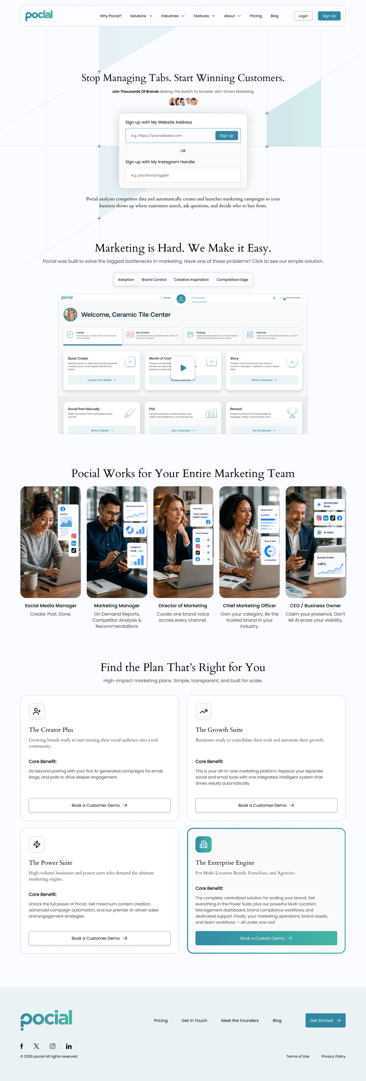
The full homepage IA in grayscale: hero sign-up, problem → solution tabs, role-based value cards, and the four-tier plan grid.
The whole platform reduced to its skeleton — the same analytics dashboard at desktop width and reflowed to a single thumb-reachable column on mobile, shown side by side.
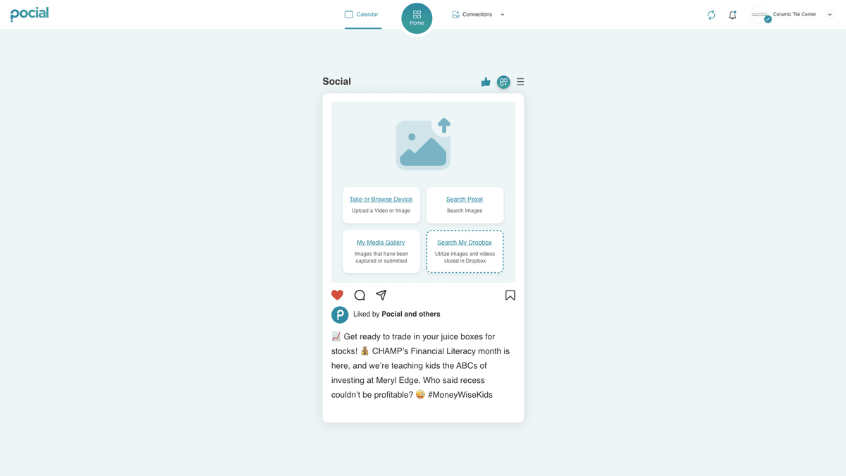
The post composer — the calendar with its slide-in publish panel and platform tabs on desktop, and the single-card social preview on mobile.
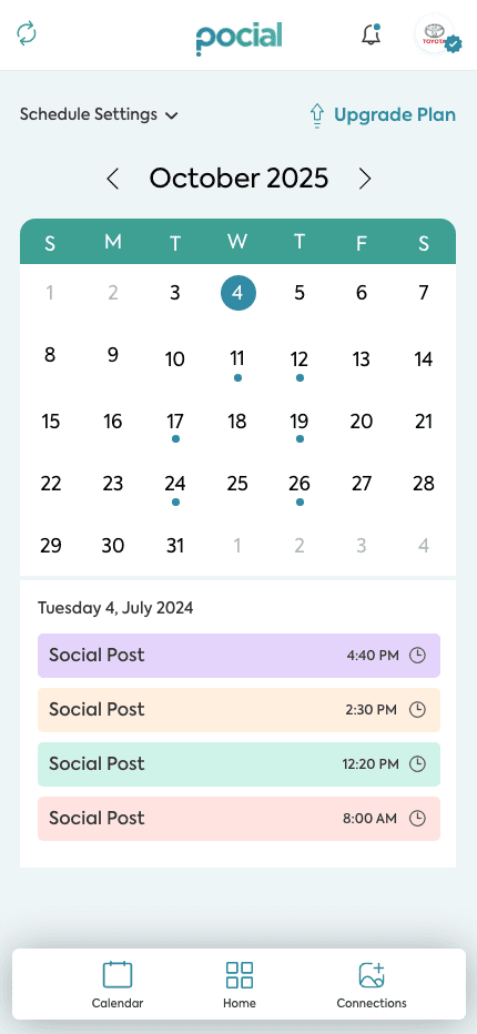
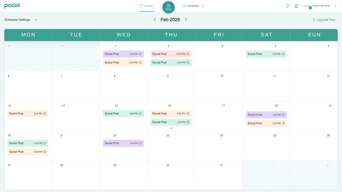
The scheduling calendar — a full seven-column month grid with post chips on desktop, condensed to a tappable month picker and a per-day agenda list on mobile.
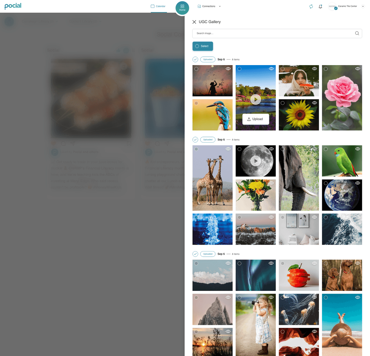
The UGC picker — a slide-in masonry gallery with multi-select on desktop, and the same library as a three-up grid sized for thumbs on mobile.
The AI campaign assistant — a three-pane builder (history, conversation, channel outputs) on desktop, reframed as a guided, stepped prompt form on mobile.
Warm, human, and unmistakably teal.
A dual-font system pairs an editorial serif (trust, weight) with a clean sans (modern, efficient) — the brand's duality in type. Teal is used with discipline: it only ever marks the next action or the reassuring word.
From homepage to the whole platform.
The shipped design carries one voice across every surface — the marketing site that sells the promise, and the platform that keeps it.
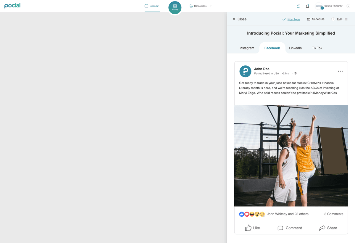
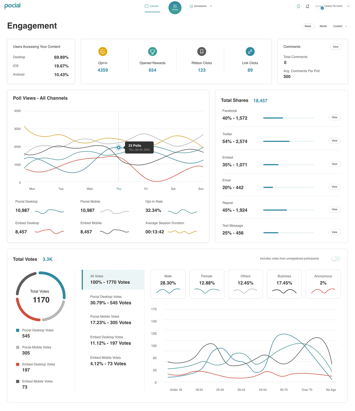
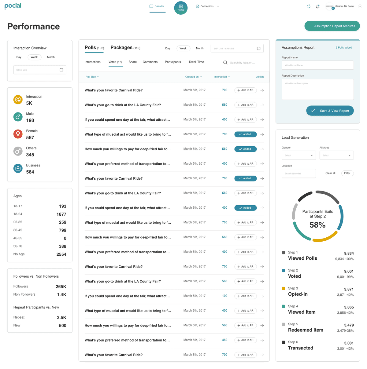
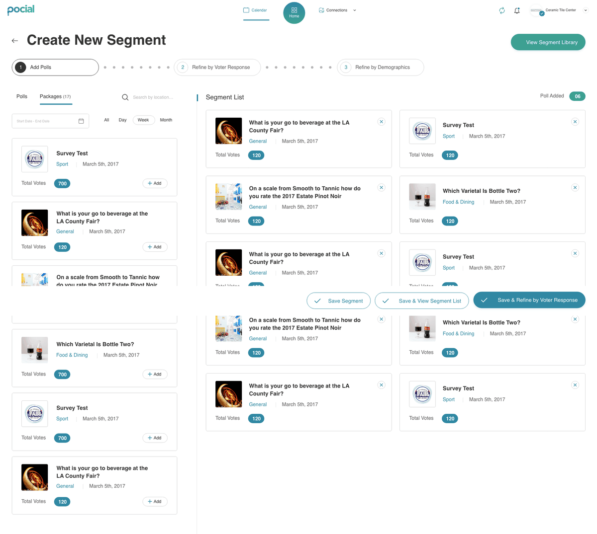
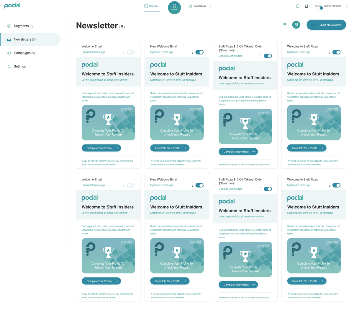
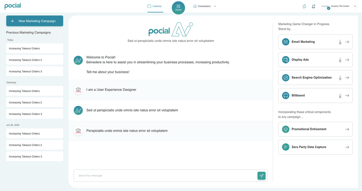
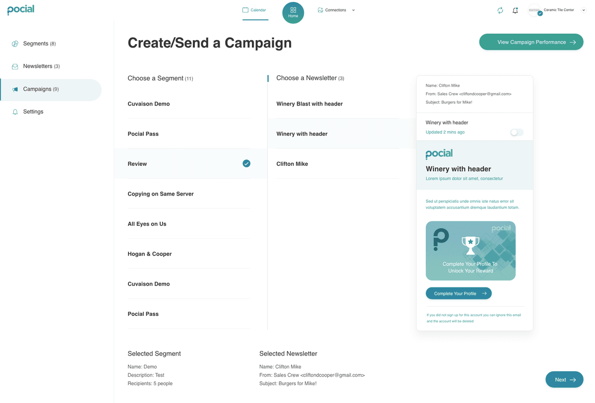
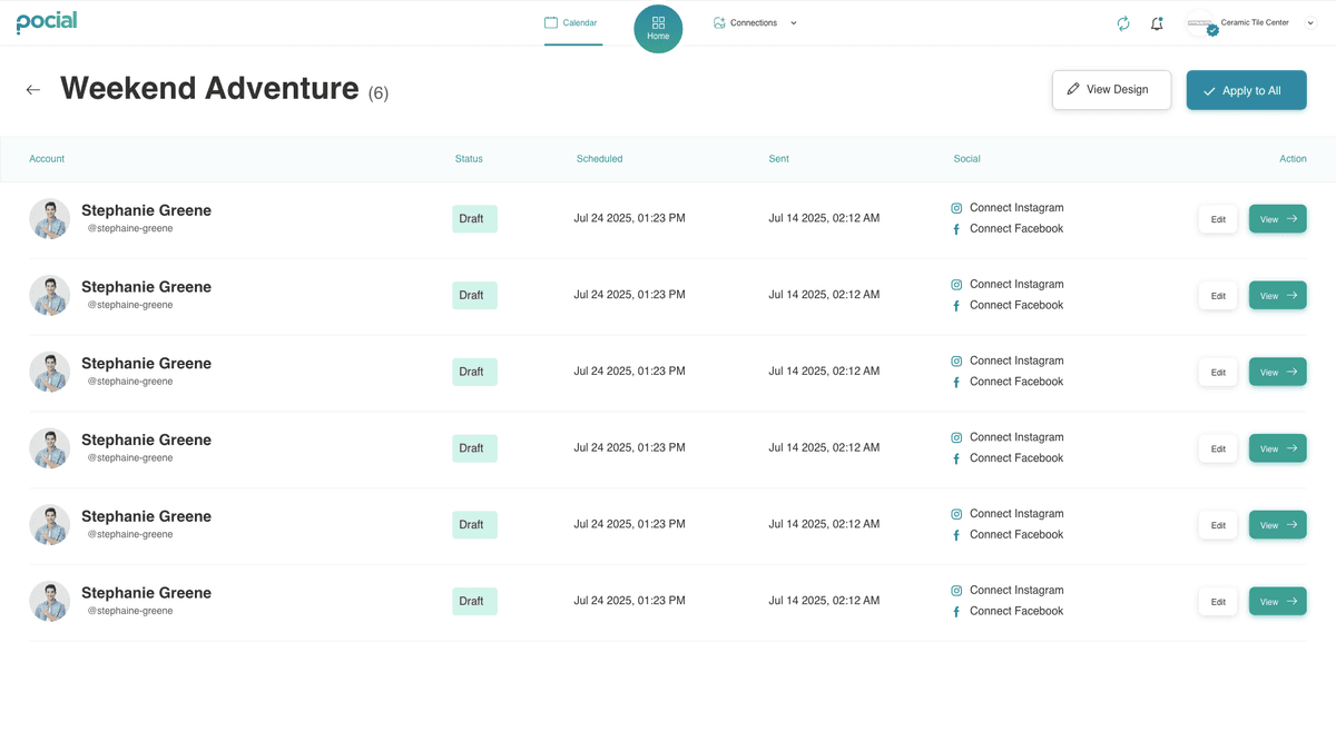
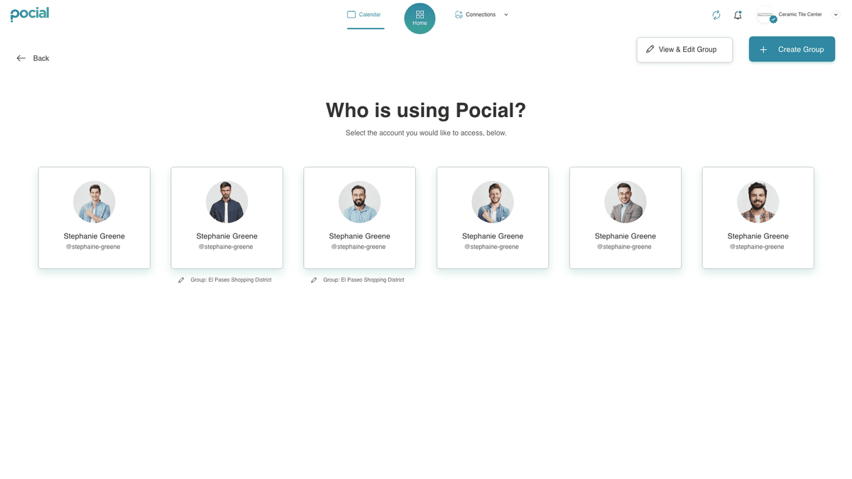
Built for the phone first.
Most posting happens on the go. The same system reflows to a single thumb-reachable column — browsing the UGC gallery, previewing a post, and walking the AI campaign prompt without a single pinch-zoom.
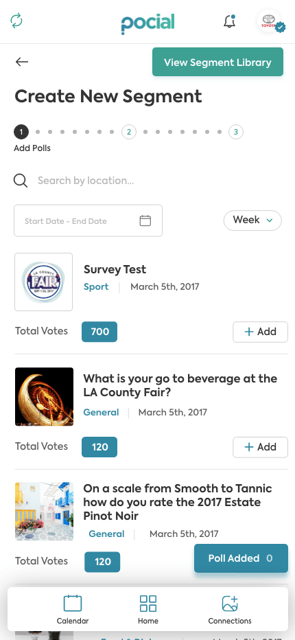
Create New Segment · polling flow
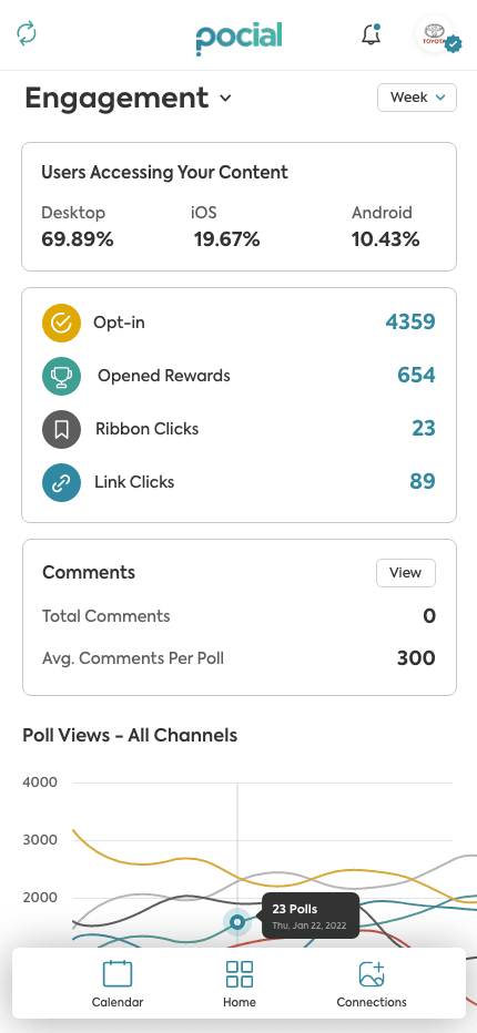
Engagement · analytics dashboard
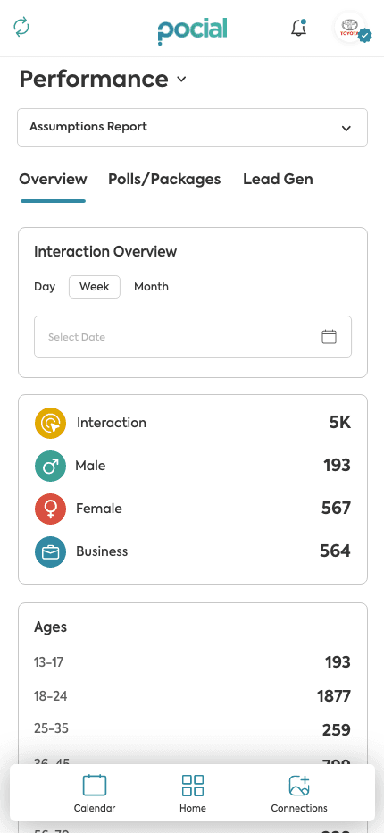
Performance · overview
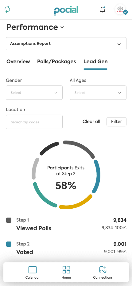
Performance · Lead Gen funnel
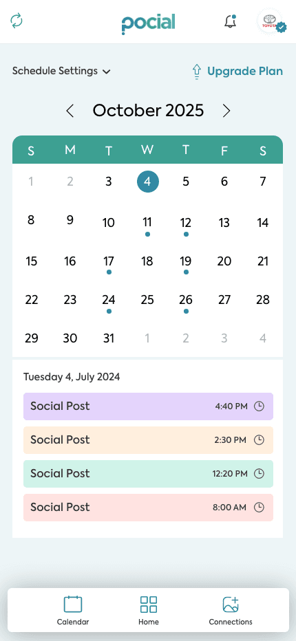
Schedule Calendar · content planning
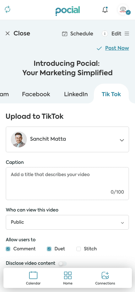
Upload to TikTok · publishing flow
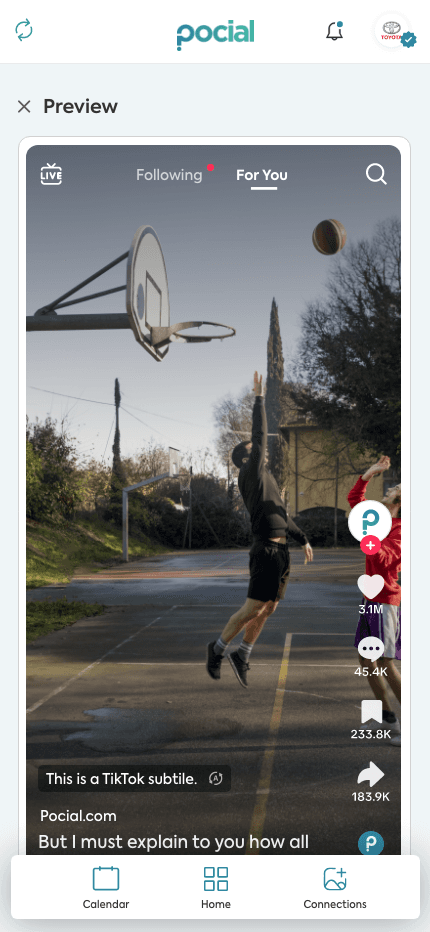
Content Preview · live feed
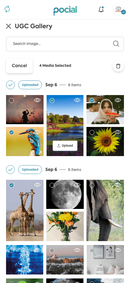
UGC Gallery · media selection
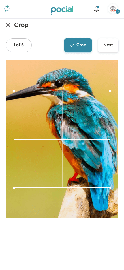
Crop · image editing
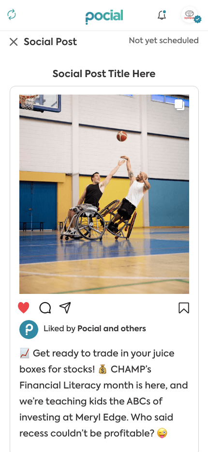
Social Post · preview
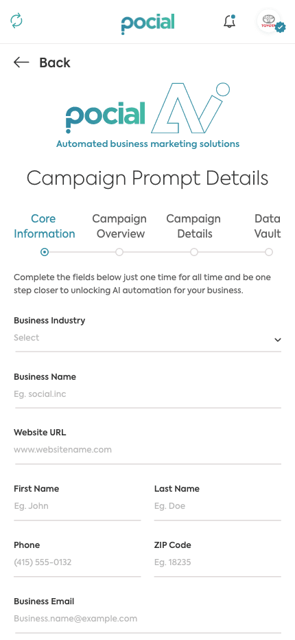
Campaign Prompt · Core Information
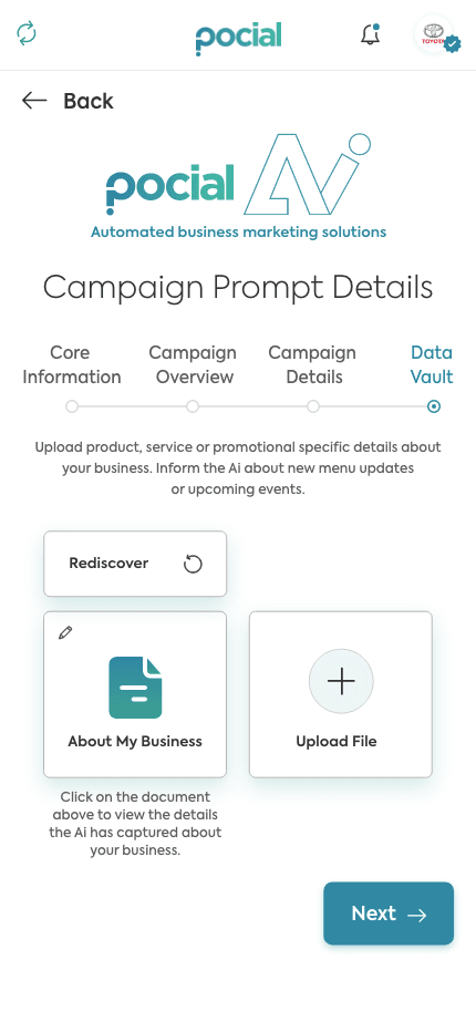
Campaign Prompt · Data Vault
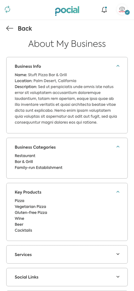
About My Business · business details
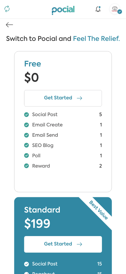
Pricing · plans
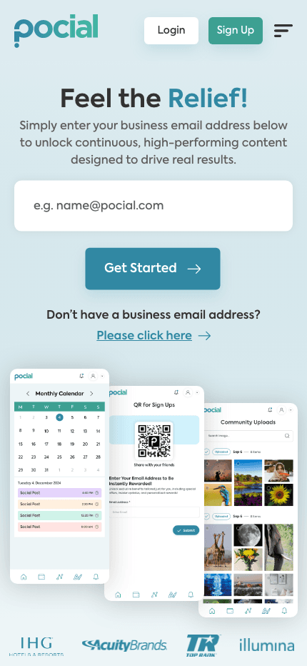
Login / Sign Up · onboarding
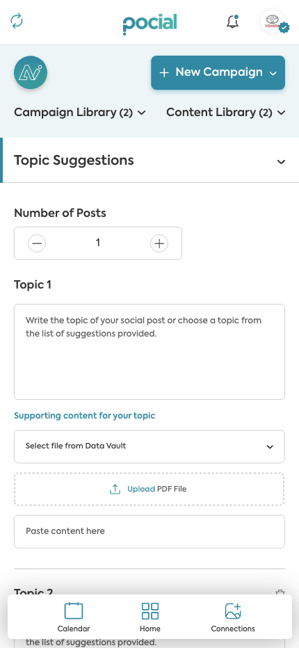
Topic Suggestions · content creation
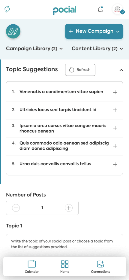
Topic Suggestions · expanded list
How I'd prove the bets actually work.
Each design decision was a hypothesis. Before shipping, I mapped out four tests — one per core bet — with a concrete method and a measurable signal I'd trust.
Visitors self-select the right journey on the first screen.
Color-coded hubs make 20+ tools findable without a persistent menu.
Fear-then-reassurance headlines make the value land faster.
A single capture reaches a scheduled post in under a minute.
— 17 / Scope & what it's built to do
One coherent system, end to end.
Screens shipped as one system — marketing site to platform
Audiences routed cleanly from a single homepage
Color-coded hubs replacing a 20-item sidebar
Design language across every surface and breakpoint
Clifton D. Cooper · Co-founder & CEO, Pocial
What I'd push on next.
— 01
Anchor the pricing.
"Book a demo" suits enterprise, but SMB visitors want a number. A starter price would cut a trust gap.
— 02
Instrument the routes.
Tag every dual-path entry point so we can see which audience each headline actually wins.
— 03
Onboard by role.
Tailor the first session to the role chosen at signup, so the empty state already feels personal.